Qafqazinfo.az — News Portal
Rebuilding a leading news portal without losing a single search ranking — the full archive moved over, pages made fast, images made light, and a mobile-first design.
About the project
Qafqazinfo.az is one of Azerbaijan’s most-read news portals. The site had been running for years, and the accumulated articles had earned it strong positions in Google. Our brief was to rebuild the site — without giving up any of that search traffic.
Moving the archive
We built a tool that read the entire existing site. It walked the old pages and carried the articles, categories, publication dates and images across into the new site. Not a single article had to be re-entered by hand.
Protecting search traffic
The new site needed a different address structure, so we mapped every old link to its new address and redirected it permanently. As a result:
- Links already in Google’s index did not break
- Inbound links from other sites kept working
- Organic search traffic held up through the move
Speed
On a news site the same page is requested thousands of times a minute. Instead of rebuilding it every time, the site keeps ready-made copies of its busiest pages and serves those. Page load times dropped dramatically, and the site stays up when a big story sends traffic spiking.
Images — the heaviest thing on the page
On a news site it is not the text that makes a page heavy, it is the images. So we treated them as a piece of work in their own right.
First we fixed the folder structure. On the old site the images had effectively all been dropped into a single folder, and after years of publishing that folder held tens of thousands of files — slow to work with and painful to back up. In the new site images are filed by date, so everything stays manageable.
Second, we optimised the images automatically. An editor uploads a picture as it is, and the site produces the size it actually needs, compresses it, and keeps the result for next time. Which means:
- Editors never have to crop and resize by hand
- A reader on a phone is not sent the full-size file meant for a desktop layout
- Each size is produced once and reused for every reader after that
On a mobile connection, that fed straight through into how fast the page appeared.
Mobile-first
The analytics were clear: most readers open the news on a phone. So we put the mobile experience first — the mobile page was designed and tuned before the desktop layout, not after it.
We no longer maintain the site, but the design we delivered and the system running behind it are still in use today.
Screenshots
Real screenshots of the work as we delivered it.
- qafqazinfo.az
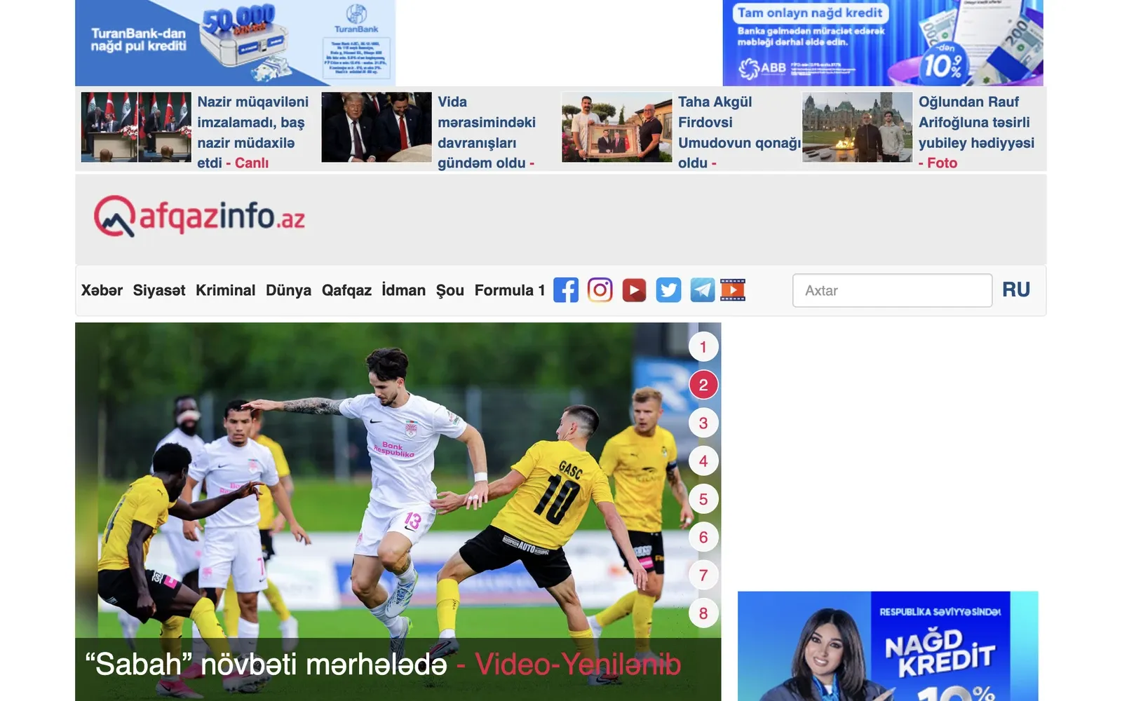
The home page: category navigation, the lead story carousel and the news feed beneath it. - qafqazinfo.az
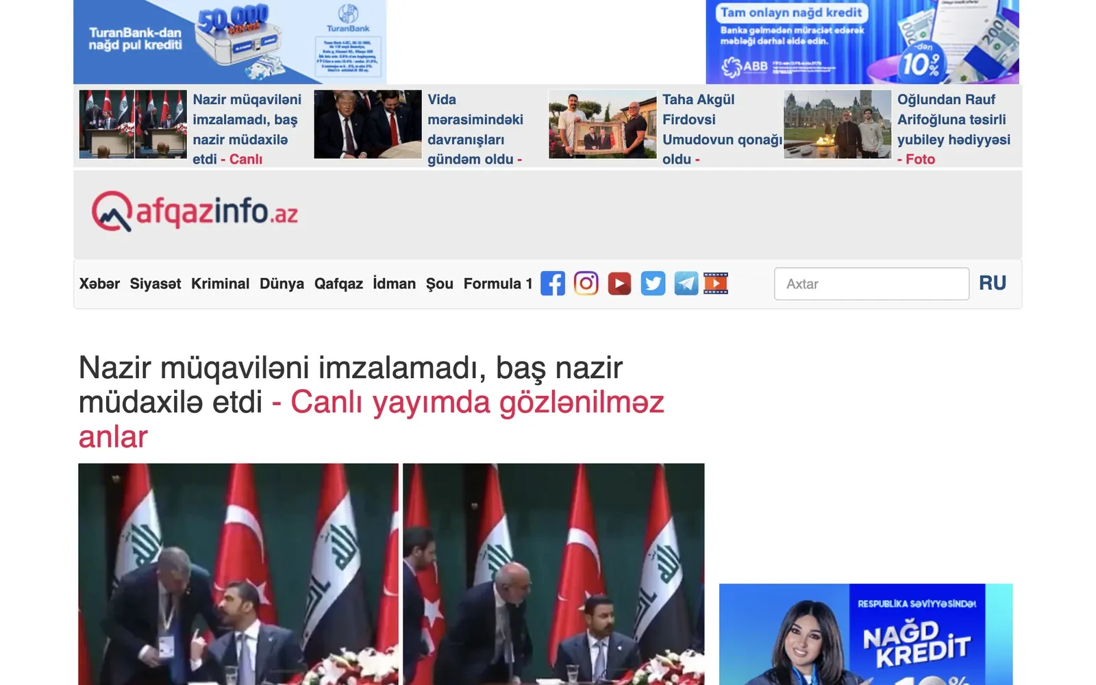
An article page. Every photo on it is delivered at exactly the size the page needs, so it opens quickly. 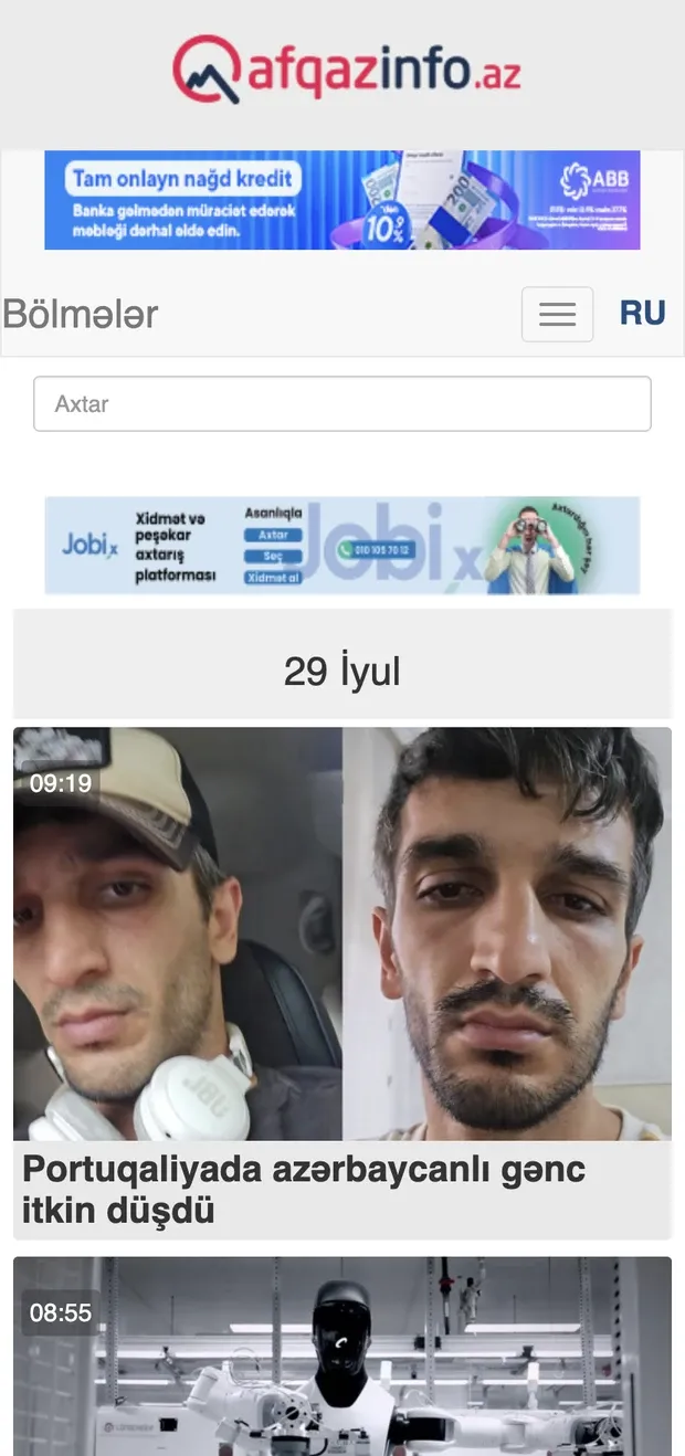
The mobile layout — designed and tuned before the desktop one, because that is where most readers are.